Posts

Showing posts from October, 2022

Super human -

Image
 This advert helps challenge the views on people with disabilities and presents the strength they have to overcome different challenges that they have individually had to overcome in their life  Preferred - the preferred view of the producers is that disable people can do the same or compete in the same activities as perfectly fit people.  Opposed - An opposed view is that people in a wheelchair can still move as well as people with legs around areas such as tennis court and still find ways around disabilities Negotiated
AXE poster

Image
 18/10/22 - New AXE peace - MAKE LOVE NOT WAR Poster There is a mixture of genders in the poster, all of which look like couples or people in a relationship. In about mid 20s as they don't look very old and have some enthusiasm to do demanding or exciting activities. They all look amongst the category of ordinary people just going on dates or doing fun stuff. Viewers are kind of encouraged to be like the people in the advert as the are being kind to each other and having a good time instead of promoting violence. The clothing codes suggest the man has the more soldier-like and manly job whereas the women are wearing beach clothes like swim-suits. Man in an army suit, women in a bikini (sexualised). Everyone in the advert looks happy or having fun which demonstrates the idea of peace and happiness without violence. The recognisable stereotypes are that the women will rest on the man or look lovingly at the man but its not as re-enforced as the men are also doing similar things. One

KOTV theatrical poster analysis

Image
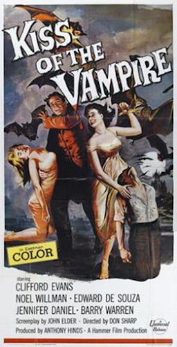
  Codes and conventions used in the poster is that women are controlled by or seen as weaker than men. This is represented due to the women's positioning in the advert. They are both either seen as sexualised or as gazing lovingly at the male figure in the poster. This is done by body language. This supports the stereotype of the time period due to how women to men relationship are represented in the form of composition and body language They layout and design presents are used by rule of thirds which has the 4 characters shown on the poster, as the main characters and to give impressions of the film. The title at the start is spread all across the page and in a large font to draw attention to it. The composition of the poster has been designed to present the characters at the front with mixed emotions on their individual faces, presenting different moods of the film, with some people in distress or harm and one of the women gazing at the man in the poster. There is also an inclusi

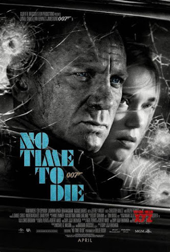
James Bond film poster - womens role analysis

Image
Codes/Conventions Layout/Design Images FONT Mise-en-scene Graphics/Logo Language Anchorage of image

Component 1, Advertising and Media Language Rolex watch advert

Image
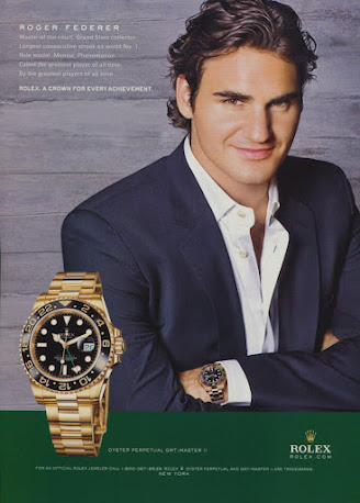
 This media advert presents the ideology of Rolex being high quality and luxurious brand, selling the lifestyle for upper class, and celebrity endorsement allows for more people to be attracted to the product. It sends the meaning due to the slogan saying a Rolex is a crown for every achievement, which gives the idea it is for successful people and a must have for people when they achieve something.  There is very little information or selling points regarding the watch, but mostly information on Roger Federer in the advert, and makes it a key detail that a famous and highly successful athlete is the brand model for the product. The attention is drawn away from the product by some extent having the model as the main focus on the page, however there is an enlarged image of the watch, and it is shown in front of the model which gives the idea that the watch is still the main point of the advert. The stereotype of the advert is that watches of luxurious/gold style are traditionally worn b

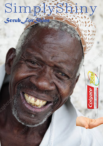
Against Stereotype toothpaste advert

Image
 

Tide advert

 In the tide advert the company have used this advert as a way of advertising their cleaning product in a way that will appeal to women and men for buying cleaning products for their wives to use whilst the men are out working. They have done this by including a large image of a women hugging and gazing dream-like towards a box of washing cleaner. The use of the imagine gives a meaning to the audience that women of the time period absolutely loves the product, which was a stereotype for the time period. The layout shows 2 slogans at the top, one in bright red to get peoples attention to the headline and one in black right at the top, to show factual or a selling point to encourage people to buy the product being advertised. There are numerous diagrams or images around the page, all showing a repeated image of a women smiling which gives the impression that women enjoy cleaning which further points out the clear difference in times between the advert and current day. Alongside the main