KOTV theatrical poster analysis
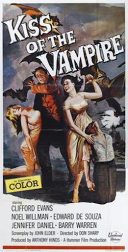
Codes and conventions used in the poster is that women are controlled by or seen as weaker than men. This is represented due to the women's positioning in the advert. They are both either seen as sexualised or as gazing lovingly at the male figure in the poster. This is done by body language. This supports the stereotype of the time period due to how women to men relationship are represented in the form of composition and body language
They layout and design presents are used by rule of thirds which has the 4 characters shown on the poster, as the main characters and to give impressions of the film. The title at the start is spread all across the page and in a large font to draw attention to it.
The composition of the poster has been designed to present the characters at the front with mixed emotions on their individual faces, presenting different moods of the film, with some people in distress or harm and one of the women gazing at the man in the poster. There is also an inclusion of a lifeless looking man on his knees that either presents he has been killed by one of the characters or is being controlled by the women as she has her hand on him. There is also a full moon, bats and an eerie looking building in the background to build up fear for the reader when they view the advert
The images and views of the people are of a mid-shot as you can see all of the people in the poster and a distant shot of the moon and building in the background. The focus is on the characters at the front to display them as more important and gives the audience an idea of the appearance and first glance of the main characters.
The typography at the top of the page is large and in an unusual serif font to draw attention to the title and to stand out on the page. The font draws people attention and helps the advert give the impression of spooky and horror. The fact the title is slanted also assists the ambition to make the title seem spooky to the reader. The names of the actors at the bottom is in a more formal sans-serif font to just name the actors instead of giving more details about the actual film.
The costumes of the 2 female characters are very sexualised and relatively long dresses with heels to support the stereotype of how women were supposed to dress in the time. The colour of the background is very dark which refers to the aim of the advert to signify the appearance of horror to the audience its aimed at. The man on his knees in the advert looks like an everyday normal man of the time whereas the other man is dressed as a vampire and has the 2 women looking lovingly at him.
The characters have been placed in the middle of the page to signify and show their importance in the advert. They can also be used to present a mini story or interpretation to the audience of what to expect or an idea about a character about how they are represented in the advert. Behind the character there is a spooky building and a bunch of bats, to further solidify and add a bigger emphasis on the idea of horror and genre of the advert and product.

Comments
Post a Comment