Adbusters Tap advert
1. The brand identity of the tap company is that their products are very expensive and extremely high quality with a high-end design. They produce top of the range taps for an elegant and impressive look
2. The advert in adbusters gives the impression that the audience are either quite rich in order to be able to buy the product or making a mockery that people will spend a lot on such a small and ordinary product compared to people that dont have access to water
3. The advert challenges the ideology of the magazine as it portrays a high end and luxury brand which is not the theme in the magazine as it mostly highlights poverty however some examples of luxury but shows the sacrifices or stereotypes of how they have been made
4. The juxtaposition of the advert with the climate change advert shows how there are some people who either cannot afford or dont have access to clean water whereas the other advert shows other people can spend loads of money in order to have a design of tap which flows water through it.
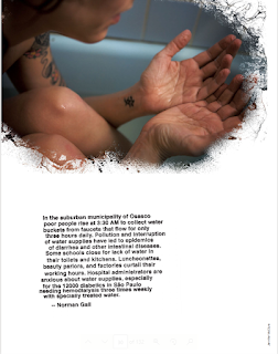
Extract from article on climate change
1. The image can be interepretated that the person is trying to have a bath but there is no water available for them to use. The way that the arms and hands are positioned could make it seem as though the unspoken message in the magazine page is that the person in the photo is begging for more water, which would fit with the text underneath it when speaking about Osasco in Brazil and how they have a water shortage compared to some places in the world. This works with the tap advert as it creates a contrast for people that are desperate for water and people who are rich and gifted enough to have access to water, who are able to buy taps in order for it to look good
2. The text underneath the image categories people to emphasise their way of life. The term 'poor people' helps create imagery in the readers head and makes them potentially feel sympathy for them. The term rise gives the impression that they are coming up from the dead or its a massive struggle or hamper to have to do it. It feels vey full on instead of choosing more relaxed terminology such as get up or wake up which sounds like a normal human thing to do. The 3.30am is important as it shows what they have to go through, as they know most of the audience will wake up a lot later than that, so it will be viewed as a difficult thing for them to do. This makes them try and put themselves in the peoples shoes.
The choice of colour on the advert being black on the background and having no bright colours, could emphasise that the climate is in a dark place and spread a negative impression to the readers who will be put off or concerned by the actual amount of carbon dioxide parts per metre. The effect of the person staring on the picture is crucial to strike fear into the audience.
Picture 4 - The image is a midshot and contains the focus image of a stereotypical homeless women, holding a cup hoping for money, sat on a side street as trying to draw attention. There is a lot of traffic on the road to show that it is a city, and in black and white to show the dark situation and fit with the text to say big cities may be lost due to climate change. The clothes that the women is wearing look very run down and potentially poor quality, suggesting they have not been washed recently. This gives the audience the impression that the women is homeless and how poor life is for some people in urban locations. The mode of address is very direct with the woman looking at the camera and giving a very miserable facial expression. The way she is sat, gives the impression that she may be cold. The text uses emotive language by the repetition of the word fear and threatening terms.


Comments
Post a Comment